An AI assistant designed for everyday sales workflows.
SUMMARY
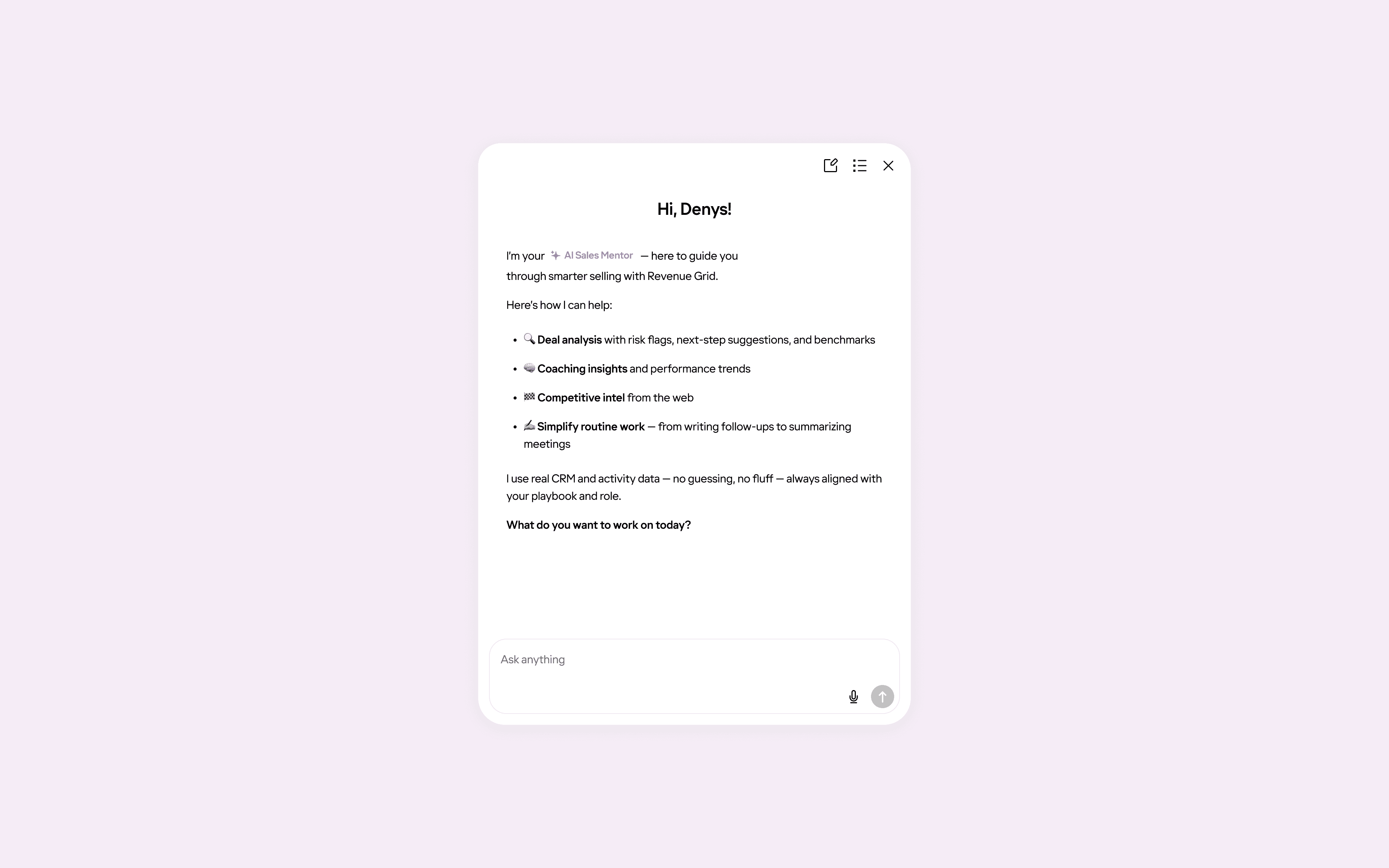
Mentor is an AI assistant in Revenue Grid I designed to help sales teams quickly find context and make decisions without digging through the platform. My work shaped it from initial concept into a feature that became a daily habit for sales teams, with roughly a third of active users trying it and one in five using it regularly.
ROLE
Product Designer
TEAM
Product Designer,
PO, Engineers
SCOPE
AI assistant design
TIMELINE
2025
CONTEXT
Designed to guide, not just summarize
Revenue Grid is an AI-powered revenue intelligence and sales engagement platform that helps sales teams boost revenue.
While the system contains a lot of valuable data, finding the right context quickly often requires jumping between multiple screens.
Mentor was introduced to help sales reps and managers not only get answers faster, but also receive deeper, context-aware guidance tailored to their situation rather than generic summaries.
PROBLEM
Too much data, not enough clarity
Sales teams spend a significant amount of time:
preparing for calls and reviews
reviewing recent activity
analyzing meetings and opportunities
understanding where the deal really stands
Answering questions like these often requires navigating across multiple sections and pages
The challenge wasn’t the information itself, but the effort required to get answers.
GOALS
Faster answers, less digging
The goal of the RG Mentor was simple: help sales teams understand what’s going on faster, without digging through the product.
Primary goal
Reduce the time it takes to understand context and make decisions during everyday sales work.
Secondary goals
Make the Mentor easy to access at any moment, without interrupting existing workflows.
Ensure answers adapt to the user’s situation instead of providing generic responses.
Build trust by avoiding overconfident or misleading answers.
SOLUTION
Making AI useful in everyday sales work
Mentor was designed to fit into existing workflows and be easy to pick up from the first interaction. The focus was on making the assistant impressive through the results it delivers, not through its interface or visual complexity.
Key design decisions
1. Familiar chat interaction
We intentionally used a familiar chat interaction model. In a complex environment, this reduced cognitive load and helped users get value immediately without adjusting their behavior.
This reduced cognitive load and helped users get value immediately.
A familiar chat pattern helped users focus on value instead of learning new mechanics
2. Contextual prompts based on page and role
Predefined prompts are not static, they change depending on the user’s role and the current context. This keeps questions relevant and reduces the need to think about how to phrase a request.
Predefined prompts adapt to the current context, keeping questions relevant without extra setup
Discoverability
Early on, the assistant’s entry point was easy to miss. As a result, only ~15–20% of active users discovered and tried the chat, despite positive feedback from those who did.
To address this, we made the entry point more noticeable:
A more visible entry point increased adoption.
After that, adoption increased to roughly 35–40%, confirming that improving visibility had a direct impact.
Daily Plan
Daily plans gave users a clear overview of what mattered for the day.
On the first login, a lightweight toast surfaced the plan without interrupting the workflow.
The plan remained available inside the chat as a quick action and was saved as a thread, making it easy to return to later.
On the first login of the day, a subtle toast surfaces the Daily Plan
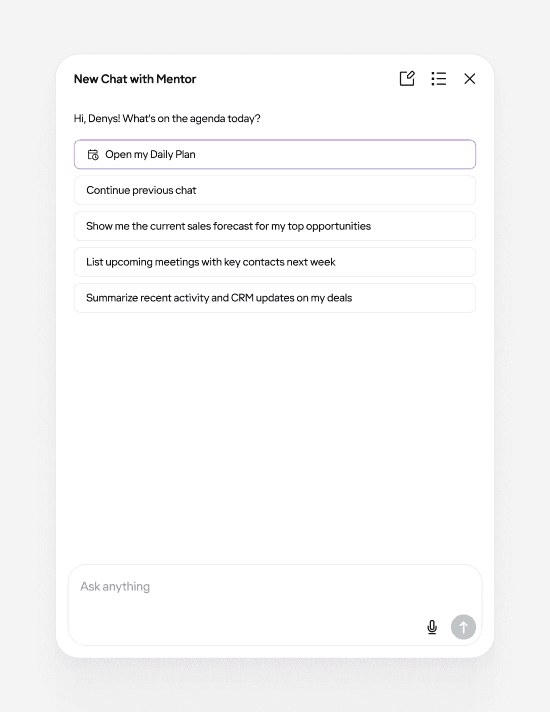
Daily Plan is shown as the main starting point, while users can also continue previous conversations at any time
Keeping context over time
Past conversations are stored as threads and can be easily searched
As usage became more regular, starting from a blank page each time became a limitation.
Threads allowed users to return to ongoing conversations, keep context over time, and treat the assistant as a persistent workspace rather than a one-off interaction.
VALIDATION
Listening before measuring
Validation was based on:
Feedback from internal sales reps and managers using the product daily
Behavioral observation through session recordings via Fullstory
Finding the right information became noticeably faster than navigating the platform manually
RESULTS
From discovery to regular use
Metrics below are directional and based on aggregated usage signals and internal observations rather than formal cohort analysis
Validation was based on:
Adoption increased after improving visibility
Adoption grew from ~15–20% to ~35–40% of active users once the entry point became more noticeable.
Improved time-to-context
Reduced average time to context from ~3 minutes to ~30 seconds. Common questions that previously required navigating through multiple screens (3–5 on average) could now be answered in a single query.
Repeat usage strengthened over time
Daily plans and saved threads encouraged users to return, shifting the assistant from occasional exploration to more consistent use.
More focused interactions
Contextual prompts reduced friction, helping users start meaningful conversations without needing to experiment with how to phrase requests.
What I learned
Designing for adoption is different from designing for value
Even a useful feature can remain underused if it’s not visible enough.
Discoverability often matters as much as functionality.
Reducing cognitive load early increases the chances of continued usage.
Context-aware guidance lowers friction more effectively than adding more features.
Small continuity details like threads and suggested follow-ups significantly impact retention.