This project focuses on information architecture and product discovery for a design community platform.
It was completed as part of a Product Design course.
SUMMARY
A research-driven redesign of KyivUX’s information architecture, covering Phase 1 of a broader website redesign to improve clarity, discoverability, and user confidence.

ROLE
Product Designer
TEAM
4 Designers
SCOPE
Product discovery, Research,
Information Architecture
CONTEXT
Product Design course
CONTEXT
Community first
KyivUX is a Ukrainian non-profit design community that brings together UX/UI, product, and service designers.
The community organizes meetups, publishes its own design books, runs a community book library, and supports research, job postings, and mentorship initiatives.

PROBLEM
Outgrowing the structure
As KyivUX expanded, the website and its structure did not keep up with the growing number of services.
It became unclear:
Which initiatives mattered most?
How can KyivUX better structure its services to increase usefulness and repeat engagement?
How new or returning members should navigate the community?
RESEARCH APPROACH
Clearing the fog
Research helped clarify the challenges faced by the growing community.
SURVEY
43 respondents
Conducted a survey to identify which services community members use most frequently and which they perceive as the most valuable.
DISCOVERY INTERVIEWS
6 respondents
Based on survey results, selected participants took part in follow-up interviews to explore service usage, navigation behavior, and areas of confusion in more depth.
COMPETETIVE ANALYSIS
A competitive analysis of similar design communities was conducted to understand how they communicate value, define entry points, and structure multiple offerings within a single platform.
KEY FINDINGS
How do members actually interact with the community?
From interviews and competitive analysis, it became clear that:
Meetups are the most useful service, but easy to miss in the chat and on the website
“Because of chat activity, it’s easy to miss meetups and announcements”
UI/UX Designer
“When I open the meetup list on the website, it looks outdated, so I prefer to check the chat.”
UI/UX Designer
Intention:
Elevate meetups as a primary entry point
It's unclear how to join the community for the new members
While most analyzed communities provide a clear call to action for joining, KyivUX currently relies on informal access paths. This approach was partly intentional to protect the community from spam, but it also creates a high barrier for new members and limits growth.
Intention:
Make joining the community clear and accessible
The chat has become the primary source of information
Community members rarely use the website because most updates are already shared in the community chat. As a result, the website is perceived as optional rather than essential.
Intention:
Improve information architecture to support discovery
Some sections do not fully align with user expectations
Community members sometimes interpret certain sections differently than intended due to naming or content structure. In these cases, users expect to find one type of information but encounter another, which makes navigation less intuitive.
Intention:
Align section naming and structure with user expectations
MENTAL MODEL
From discovery to active participant
DISCOVER
Curiosity & Relevance
Context:
People discover KyivUX through friends, colleagues, Telegram, Instagram, or Google.
Mindset:
Is this community for me?
Will I find people at my level?
Is there real value here?
JOIN
First Contact
Context:
People subscribe to the Telegram chat, follow social media, or attend their first meetup.
Mindset:
Let me see what’s happening inside.
I’ll observe first.
EXPLORE
Observation
Context:
New members rarely participate immediately. They observe, read the chat, attend a meetup occasionally.
They consume content.
Behavior:
At this stage, participation is passive but intentional. This stage determines whether someone will move forward — or stay silent.
EXPLORE → CONTRIBUTE
Activation Barrier
Most people don’t start contributing right away.
They observe first, read the chat, attend a meetup or two. They try to understand the tone of the community
Participation usually starts when:
Someone receives helpful feedback
Sees people at a similar level contributing
Or understands how they can get involved — for example, by taking part in research initiatives, joining workshops, mentoring, or speaking at an event.
Without that clarity or confidence, many remain observers.
CONTRIBUTE
Identity & Visibility
Context:
The community becomes part of their career ecosystem.
Behavior:
Active members do not just consume.
They create.
They speak at meetups.
They collaborate.
OVERHELMED
Hard to Keep Track
Context:
As the community grows, complexity increases.
Behavior:
They stop actively following updates and rely on occasional check-ins instead. The chat becomes background noise.
DRIFT AWAY
Less Frequent Interaction
Context:
Engagement slowly decreases as the community starts to feel "optional" or less relevant to the user's current level.
Behavior:
When the content becomes too repetitive or basic, senior members stop looking for answers there.
SOLUTION
Hopping On: From Insights to Structure
Based on the research findings, the team focused on restructuring Hopp.bio ("link-in-bio" tool) as a first step toward the broader website redesign, using it to validate information architecture and service prioritization in Phase 1.
The goal of Phase 1 was not to redesign the website visually, but to validate a clearer information structure, service prioritization, and entry points before moving into full-scale design.
Hopp.bio was treated as a lightweight reflection of the future website structure. Compared to the full website, it allowed faster validation, easier experimentation, and early detection of structural issues.
Hopp.bio Information Architecture Update:

Current Hopp.bio structure
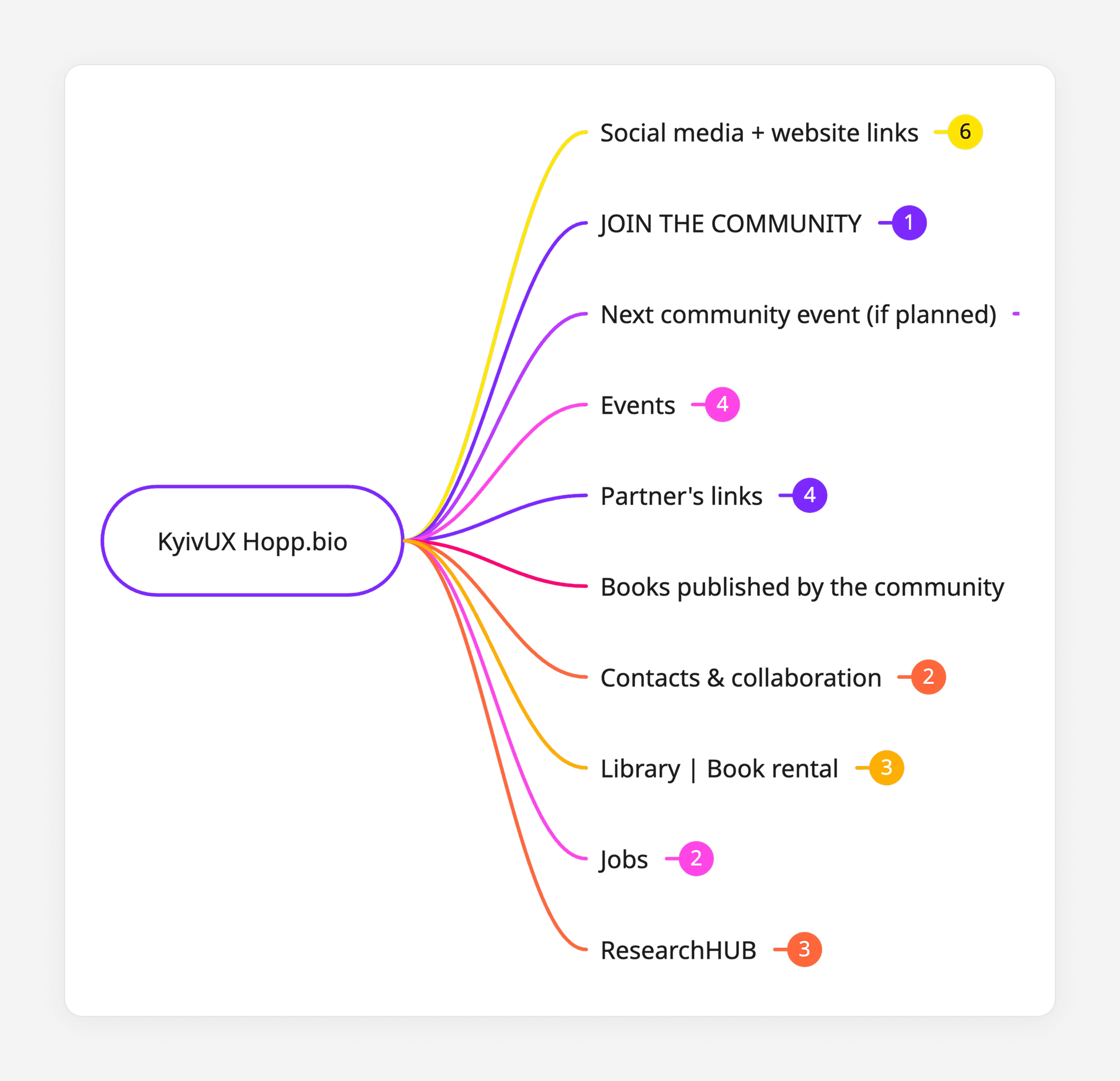
Updated Hopp.bio structure
Structural Updates:
Added a clear community entry point
A dedicated “Join the community” entry point was introduced, with the goal of lowering the entry barrier and potentially increasing the number of active community members.
Renamed “Useful” to “Partner materials”
The section was renamed to better reflect its actual content, which primarily consists of materials provided by partners.
Clarified the Library section by adding “Book rental”
The Library section was updated to explicitly communicate that it refers to a physical book lending service. This helps avoid confusion, as the term “library” is often associated with online articles or other digital artifacts.
Added direct contact options
Contact information was introduced to enable quicker and more transparent communication with the community administration.
Highlighted upcoming events as a standalone block
When a community meetup is planned, it is additionally surfaced as a separate block to increase visibility, while still remaining part of the Events section.
Hopp.bio Page:

Current Hopp.bio page (Version A)
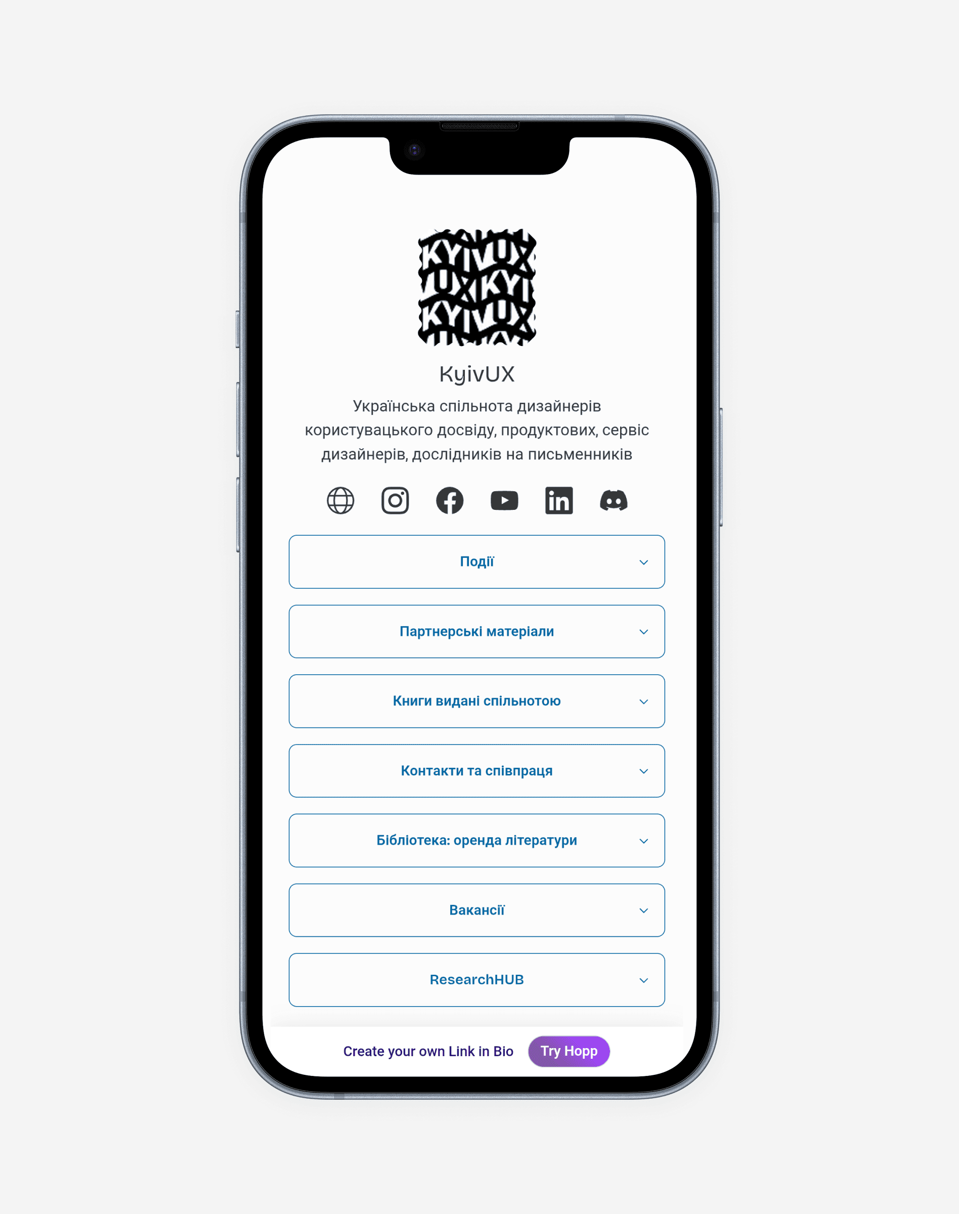
Updated Hopp.bio page (Version B)
VALIDATION
Does the New Structure Make Things Easier?
Concept validation sessions were conducted with 6 participants using a structured comparison between Version A and Version B.
The updated structure was validated through a moderated qualitative comparison.
Participants were asked to complete the same set of tasks using both:
– Version A: the current structure
– Version B: the updated structure
To reduce order bias, participants were shown the versions in different sequences (A → B and B → A)
Tested scenarios:
Imagine you want to learn about upcoming KyivUX events. What would you do? Where would you go on this screen?
Imagine you want to buy a book published by the KyivUX community. What would you do? Where would you go on this screen?
Imagine you want to rent a book. What would you do? Where would you go on this screen?
You want to apply as a speaker for an upcoming KyivUX event. Where would you go on this screen?
RESULTS
Finding Things Felt Easier
Validation showed a clear improvement in both orientation and perceived usefulness in Version B compared to the Version A:
Participants were more confident identifying where to go for events, books, and participation opportunities.
5 out of 6 participants found Version B clearer and easier to navigate
The updated structure improved:
Confidence in navigation
Users were more certain about where to go and felt less need to double-check their choices or backtrack.
Alignment with user expectations
Sections matched what users expected to find, reducing surprise and confusion across key scenarios.
Starting points for key actions
Users could quickly identify where to begin common tasks such as discovering events, accessing content, or participating in the community.
What I learned